Wednesday, December 23, 2015

GIF Project Reflection

GIF Reflection:

1. The concept of this GIF is a representation of myself. It is saying how I may look cold and emotionless on the outside, but inside I'm very nice. This idea was built based on the meaning of each images I made. For example, expressing something that is cold or emotionless, I need to find something that expresses that idea or feeling, which is where the ice came from. And something that is nice, I need to think of something that everyone think is nice, which is a sprout/flower. Since a sprout/flower is something everyone enjoy, I used that as being nice on the inside. Since the concept has something to do with outside and inside, in order to show that, I need the the ice to melt, and when it has completely melted, there will be grass and a seed blooming on the melted ice.

2.  GIF Project:


3. In the beginning, my concept involves fire melting the ice and rain erasing the fire away. However, the problem with that is, there are too many animations occurring which might take away what my concept is trying to say. So instead of that, I made the ice melt by itself. 

                 Original GIF:                                                             New GIF:


Tuesday, November 24, 2015

Portrait Transformation Reflection

Portrait Transformation Project Reflection:

Nancy Wang

3 original photos: 


Title: Isabel Potter


Concept:

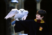
     The concept of this Portrait Transformation Project is having a friendship with Harry Potter. Since Isabel likes challenging books, and Harry Potter was one of my challenging books back then, so it was a perfect combination. Not only that, I always dream of being next to him, so Isabel is somewhat fulfilling my dream.

Steps:

     There are many steps taken in order to complete this project. My first steps were to think of a concept. After thinking about it for a couple of days, I need to search for a background picture. Since my concept is about Harry Potter, I have to search for pictures about him and pick the right one. 
     The next step is finding and taking pictures of a model. I had trouble finding one, since no one wants to have their picture taken. But in the end, I manage to find one. Then I need to think of what poses my model needs to do so I know where to put her in the Harry Potter picture. Taking pictures is a problem, since I have to make sure the lightings are right, and the model is doing the right pose. After taking a several pics, I had to choose which one is better. 
     When those are done, I had to do  all the adjustments on Photoshop. This is where the problems starts to escalate. I first need to upload my background picture, which is the Harry Potter. Then I uploaded a picture of Isabel, with her posing on the side and her hands sticking out. I started out with adjusting the tone of the picture so it matches the background picture, Harry Potter. After that, I had to resize the image itself, so the pictures match each other. After that, copy and paste Isabel onto the Harry Potter picture. But first, I have to crop her legs since I only need her upper body. So I used the laser tool and crop out the parts that I needed. I had to redo this over and over again because sometimes I would crop her hands out, or her face out.
     When I finish using the laser tool, I went to edit select, inverse so then I can crop out her background. When it did, I copy and pasted it onto the Harry Potter picture. I have to move it in the right place, where she looks like she is patting the owl. And lastly, I used Free transform to rescale Isabel so then she can be the same size as Harry Potter on the picture.
     Then I had to do the same for the other Isabel picture I took. I did the exact same thing as I did with the other Isabel picture. But this time instead of making it bigger, I made it smaller so she can sit on Harry Potters' arms as if she is happy sitting there. 

Answer:

     I was not happy with my project because in the end, it didn't turn out as it suppose to be or how I want it to be. I feel like at the end, I rush through it a lot so everything that's towards the end, is all messy and not well produced as when I first started the project. However, overall I was happy that I was able to at least get somewhat on what I want the project to look like. 


Sunday, October 18, 2015

Letter Project Reflection

Letter Project Reflection

1. First I had to think of ideas that my letter: B are associated with. For example, objects or things that starts with the letter "B" and then draw them out with the letter B in the middle. Next, I drew the associations either outside or inside of the letter.


After that, I had to pick the top 3 choices from the thumbnail sketches I drew, and then build off from it. So I asked my classmates to choose which ones they liked the best, which turns out to be:
         a) Butterfly letter
         b) B-heart shaped
         c) Bird on tree
To determine my final sketch, I had to choose 2 of those top 3 which were the B-heart shape and the Bird on tree and made small drafts of them; then decide what concept does each of them hold and draw it based on that concept. However, the B-heart shaped one has no concept, so I had to draw a new idea.


As for my final, I choose the bird one because it has a concept and I put more effort in it than the other ones. To start my final, I first practice coloring my draft, to see which colors I would use. I had to google search what colors I should use for the bird, and choose the one that has the most color value, since I know for a fact that most of the colors I'm going to use are green and brown. Then I start my final. When I first color in the tree, I had trouble drawing the branches and the leaves, so I made some drafts to see which one technique is better.


After solving the tree problems, I colored the vines. Since the vines looked a bit plain, I added flowers to it so it can look more nature like. Then, I color the bird which was very hard because I had to go dark then light, then dark again, by using different blue. Then I drew the grass with color pencil, and added another green color to have more color value. When everything was colored, the 2 curved part had nothing in it. So I colored it in as an architecture or bricks, since they are found in nature anyways. My final step was deciding what to do for my background. First I decided to make it sunset. First I tried using color pencils and mixed orange and yellow together, then I used pastels. Color pencils were better, but I decide not to add a background since it takes away the main focus.


2. In order to draw letter B with a concept, I first had to think what are some things that are  associated with it. For example, the bird one, the concept is nature (3rd photo). I had to think of things that are related to it. The first ting I thought of is bird, since it starts with letter "B" and it relates to nature. Then I thought of where do birds live, and that is where the tree came in. Then I branch off from tree to grass, and then to vines and flowers. As for the bee one (4th photo), again I first start off with the letter "B" and since "B" sounds like Bee, I started to think of ideas that are related to Bees. I then thought where do Bees live and they live in a honey comb, then where is the honey comb located at, which is on the tree. So the whole concept is Bee related.

3. The most challenging part of this project was the size. From the drafts to the final, the size of the letter is doubled. I wasn't sure if my "B" was big enough or if everything can fit in the paper. But everything was ok. Another challenge I had was making sure my colors are different. I don't want my whole letter to just have 2-3 colors. I want it to have a lot of different colors. This relates to my other challenge which was value. For example, the leaves on the tree, I don't want to have just one shade of green, I want to have variety of it. Making value with just one color is hard and takes time.

4. Overall, I am satisfied with my project. I had a lot of fun making it. Although some parts are frustrating however I had fun drawing the things I liked, like the tree, bird, and flowers. I like drawing nature related stuff, which made this very fun.

5. If I can change something about my project or do something differently, I would add a background, since the picture looks like it's in a middle of nowhere; which makes helps the viewer to focus on it, but it just looks a bit plain to me. But overall, everything is fine the way it is.

Sunday, September 27, 2015

My summer vacation!

Hello! My name is Nancy Wang! ^^ My Graphic Design teacher, Ms. Lee told us to posts pictures of what we did during our fabulous summer. So, this is what I did throughout my boring summer:


During my summer, I went to Canada with friend. We went to visited a college, which was University of Buffalo. When entering their campus, the professors was handing out free Buffalo toys to people who were visiting their university. Not only that, the Niagara Falls was only 20 minutes away from the university, so we took the cruise to take a look at the waterfalls. At first, I thought this was going to be a boring trip and a waste of my time, but when I got there, it was wonderful and fantastic.