Monday, April 4, 2016

Favorite Logos


My favorite logo is from Barnes & Noble. The reason why I like this logo is because of the color choices and the design. Although it is not as fancy as the other logos, such as Snapchat, or Twitter, however, it still has its own unique features. Barnes & Noble is a store where people buy books, read them, and relax. They even have Starbuck. The place itself is really chill and relaxing, which can be indicate in the logo. The color choices of using green and brown makes it seem really peaceful and really earthly and gives the audience the idea that the store is really relaxing. Not only that I really like the products that Barnes & Noble have.


1. This is a very interesting logo because it stacks different kinds of animal onto one another. One part is a picture of a dog, and drawn onto it is a cat, then it's a rabbit. Although the pictures are drawn on top of each other, it is still easy to identify what animal it is. Not only that, the color background really helped to boost the idea of Vets.


2. This is also a very interesting logo. The word "Fawks" sounds like "Fox" which could be a pun, or just a random word. Not only that, the picture is a Fox with its upper body made from cloth and other half is made from its actual body, making it really interesting.


3. This logo has this casual and cute features. The color choices makes the whole logo look so calm and peaceful. I also like the idea that there is a scarf wrapped around the cloud, showing that people should keep warm. By using a different color for the scarf, it really stands out to the viewer.


4. This logo has this cool and nature atmosphere. By adding a badge and having it carved in the shape of the deer, it emphasis the idea it's trying to portray. Also the background is a forest which really helps to emphasis the theme of nature. Although the color choices are kind of dark, it really focuses the main idea of the forest.


5. This logo is somewhat plain but the design and the font is really catchy. Although it is hard to read what the big sign is, the design of it kind of says what it means. Those lines surrounding the font makes it seem like it's something related to nature or the idea of trying to be pretty or healthy. Plus, the color choices are plain, but it fits the idea of what this logo is trying to say.

Tuesday, March 22, 2016

Poster Reflection:


1.  I believe my stance is clear. The way I show my stance is by putting a cat inside a hour class. A hourglass has sand inside it, so by putting a cat in it, it shows that animal needs help and someone needs to come save them. Plus, by using a hourglass it also shows that time is running out, and that you need to save the animals fast. Not only that, I emphasis the idea that time is ticking by putting a clock as the background.

2. I think my idea from my thumbnail sketches to my actual digital poster is successful to some extent. Sadly, I was unable to create the effects that I had on my thumbnail sketches onto my digital one. And the fonts and the layout of them changed. Originally it was suppose to be on the top of the hourglass, but it ended up inside the hourglass.

3. My first version it was a cat inside the hourglass crying for help and have a clock has its background. My second version was the same thing, however, I split the page in half, where my first version is on half of the page, and the other half would be pictures of animals being sheltered, to spread the awareness of it. The only reason I added more pictures of animal shelter because it helps to emphasis the idea that animal needs the love from us and that they need us to take care of them.

4. I think the strongest aspect of my poster is the concept because I try to emphasis the idea that animals need to be save by putting it in a critical situation, and show awareness that time is an essence. The weakest aspect of my poster would be design because the colors and font that I used shows what looks good on the poster rather than what helps to show that my poster need to be seen by others and prevent the animal crisis from happening.

5. The most challenging aspect of this project conceptually was thinking how my poster will look and what I should do to make my concept clear. It's really hard to think of a perfect image that people can understand. I need to think about the pictures I'm going to use, and what kind of poster I want it to be.

6. The most challenging aspect of this project was using the tools from Adobe Illustrator. It's hard to use it and create the image that my mind has created. It's hard to remember what I have to do to do this and that. Not only that, I need to use Adobe Illustrator AND Photoshop, which makes things more complicated, since I have to keep going back and forth between these two programs, and making it really confusing.

Tuesday, January 12, 2016

What's Your Stance?

Donald Trump:

     Personally I don't interact with any social media as often as other people. I don't have Instagram, Snapchat, and any other social media. Even if I have Facebook and such, I don't use them often. However, I do read or watch a lot of news on television about events that are occurring in the United States.
     For example, the events that occurred relating to Donald Trump's point of view. To be honest, I disagree with every single aspect of his speech, especially the ones that regards to the Muslims. He talks a lot about the Muslims, and showing such discrimination towards them. Not only towards the Muslims but every single race out there. He wants to deport the Muslim out of the country, saying how they are a dangerous ethnicity because they bombed the Twin Tower in 2001. The fact that a lot of Americans and other people have lost their lives and suffered are unfortunate, however, that is not a good reason to kick out the Muslims. Not all Muslims have committed such sins, also, there are no proof that they did such a thing; therefore, it is just an illogical accusation.
     With that said, I did not share this with anyone since I watched these on the television news. However, my parents and my brother seems to agree with my statement. Also, they disagree with the fact that Donald Trump describes women as pigs. Such insult and discrimination was offended to us women, especially those who are feminists.
     Throughout all his speeches, he did not say anything positive things regarding race such as Muslims and gender. He is freely saying whatever he wants  and insulting others without thinking the consequences nor the result it will have on the people he's talking about. Personally, I think he said those illogical comments in order to gain votes to be the next President. Therefore, I think he does not deserve such respect from United States, nor from the Republicans.

Other topics:
1. Global Warming
2. Animal Abuse
3. College Campus Issues: (Rape/Discrimination)

Links:
http://www.mrconservative.com/2014/09/50020-donald-trump-ditches-political-correctness-slams-muslims-everywhere/
http://www.thepoliticalinsider.com/video-resurfaces-donald-trumps-views-on-the-muslim-problem-whoa/


Wednesday, December 23, 2015

GIF Project Reflection

GIF Reflection:

1. The concept of this GIF is a representation of myself. It is saying how I may look cold and emotionless on the outside, but inside I'm very nice. This idea was built based on the meaning of each images I made. For example, expressing something that is cold or emotionless, I need to find something that expresses that idea or feeling, which is where the ice came from. And something that is nice, I need to think of something that everyone think is nice, which is a sprout/flower. Since a sprout/flower is something everyone enjoy, I used that as being nice on the inside. Since the concept has something to do with outside and inside, in order to show that, I need the the ice to melt, and when it has completely melted, there will be grass and a seed blooming on the melted ice.

2.  GIF Project:


3. In the beginning, my concept involves fire melting the ice and rain erasing the fire away. However, the problem with that is, there are too many animations occurring which might take away what my concept is trying to say. So instead of that, I made the ice melt by itself. 

                 Original GIF:                                                             New GIF:


Tuesday, November 24, 2015

Portrait Transformation Reflection

Portrait Transformation Project Reflection:

Nancy Wang

3 original photos: 


Title: Isabel Potter


Concept:

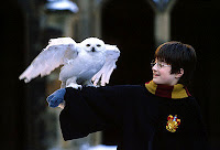
     The concept of this Portrait Transformation Project is having a friendship with Harry Potter. Since Isabel likes challenging books, and Harry Potter was one of my challenging books back then, so it was a perfect combination. Not only that, I always dream of being next to him, so Isabel is somewhat fulfilling my dream.

Steps:

     There are many steps taken in order to complete this project. My first steps were to think of a concept. After thinking about it for a couple of days, I need to search for a background picture. Since my concept is about Harry Potter, I have to search for pictures about him and pick the right one. 
     The next step is finding and taking pictures of a model. I had trouble finding one, since no one wants to have their picture taken. But in the end, I manage to find one. Then I need to think of what poses my model needs to do so I know where to put her in the Harry Potter picture. Taking pictures is a problem, since I have to make sure the lightings are right, and the model is doing the right pose. After taking a several pics, I had to choose which one is better. 
     When those are done, I had to do  all the adjustments on Photoshop. This is where the problems starts to escalate. I first need to upload my background picture, which is the Harry Potter. Then I uploaded a picture of Isabel, with her posing on the side and her hands sticking out. I started out with adjusting the tone of the picture so it matches the background picture, Harry Potter. After that, I had to resize the image itself, so the pictures match each other. After that, copy and paste Isabel onto the Harry Potter picture. But first, I have to crop her legs since I only need her upper body. So I used the laser tool and crop out the parts that I needed. I had to redo this over and over again because sometimes I would crop her hands out, or her face out.
     When I finish using the laser tool, I went to edit select, inverse so then I can crop out her background. When it did, I copy and pasted it onto the Harry Potter picture. I have to move it in the right place, where she looks like she is patting the owl. And lastly, I used Free transform to rescale Isabel so then she can be the same size as Harry Potter on the picture.
     Then I had to do the same for the other Isabel picture I took. I did the exact same thing as I did with the other Isabel picture. But this time instead of making it bigger, I made it smaller so she can sit on Harry Potters' arms as if she is happy sitting there. 

Answer:

     I was not happy with my project because in the end, it didn't turn out as it suppose to be or how I want it to be. I feel like at the end, I rush through it a lot so everything that's towards the end, is all messy and not well produced as when I first started the project. However, overall I was happy that I was able to at least get somewhat on what I want the project to look like.